Friday, October 27, 2006

Mary and Jane Live On


Two of my dearest friends died from breast cancer. Both of them were schoolteachers that the rest of us could only hope to emulate. Their names were Mary Marek and Jane Cox. When our newest elementary school was named for Mary, her children and grandchildren were honored to have Barbara Bush attend the dedication. The picture on the right side is of Jane's granddaughter, Lyndsay Mavus.

Coquettes 2006


For the past 20 years, we've spent the 3rd weekend of October together. There were 12 of us to begin with, some going back as far as kindergarten, but all of us friends at least as far as junior high on.

We gathered at Rose's house in Nacogdoches in 1987 and that was the only time that Gayle joined us. Sue has only come about 3 times--but the rest of us rarely miss--and Rose has perfect attendance (even when she was bald from chemo!)

Last year was so bittersweet, as it seemed that Cookie was holding onto life until we could be together when she passed away on that Saturday evening and we threw our sand dollars into the ocean.

This year we met in Longview, and Helen gave us a wonderful DVD with old photos and songs to commemorate those we've lost, as well as to remember all the good times.

Each year Sally has a T-shirt made for us, and it's always a great surprise and delight to see what she comes up with. This year the front shows a Chevy topped with the slogan "Young and Foolish," while the back says "Now we are old and wise" and shows caricatures of each of us.

The Sister Study


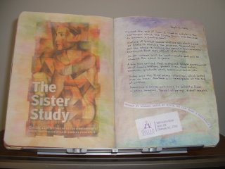
Toward the end of June, I read an article in the newspaper about The Sister Study and decided to become a participant. Sisters of breast cancer victims are about twice as likely to develop the disease themselves and the study is looking for genes and environmental exposures that may affect risk levels. Since two of my sisters and several friends have had breast cancer, I thought this was the least I could do to help in some small way to find a cause and a cure for this awful scourge. I pray it will come in time to protect our daughters, nieces, and grandchildren.

50,000 women will be participants and will be studied for about 10 years. If you want to learn more, look here: http://www.sisterstudy.org/English/index1.htm

A box soon arrived that contained several questionaires about family history, places lived, food eaten, exercise, products used, medicines taken, etc.

Two phone interviews were done, each lasting about an hour. These were spaced around a month apart. A nurse also came to the house to collect blood and urine samples, toenail clippings, and dust samples.

For this spread I used the illustration that accompanied the newspaper article, extending the colors with soft pastels. On the right side, I glued down a couple of items clipped from one of their mailings.

I've Got the Whole World in My Hands


The first project that we did for Imagine8 was to illustrate what our hands mean to us. Recently I decided to attach the prototype into one of my composition journals. I chose a spread with background colors that look somewhat like land and water. I found a NASA photo of North and South America which I tweaked into an oval with the help of my computer. (I discovered by trial & error that it needed to be an oval when flat, to look like a sphere in 3-D.) Then I printed it out in the center of a piece of cardstock and folded it in half. Next I traced my hand by placing the pinkie side right on the fold. Then I cut narrow strips across the image of the Earth from the fold to where the color stopped. Working one at the time, these strips were folded back at the outline on both sides and then popped out in the opposite direction from the hand fold. The outline of the hand was cut while folded and a second set traced onto another piece of cardstock. These were delicately tinted by rubbing soft pastel dust onto them. After coloring a blue oval in the center of the second set of hands, the separate hands were glued together, keeping the "earth" free of glue. I got the idea for how to make this work from the directions for a mummy's tomb in the book "The Usborne Book of Pop-Ups."

The 10 large words on the fingers are feelings that are heightened because of my hands, while the smaller lettering is a sampling of things my hands allow me to do. These say: "hug a loved one, ink a rubber stamp, make beautiful letters, drive a car, surf the web, knead bread dough, wield a paintbrush, comfort a friend, plant a garden, bind a book, pat a back, turn pages in a manuscript, stitch with needle and thread." A hand has always been a significant symbol for me, as it is my maiden name. Perhaps you've noted that in the names of my blogs.

One of the photos shows the hands in a "closed" position, while the other is how it looks when "open."

Saturday, September 02, 2006

August Calendar


For my August calendar spread I used a plastic stencil with different types of squares to make the daily spaces. I drew these with a Pitt pen since it's waterproof. Then I used Neocolor II watersoluble crayons to apply the color and blended with a waterbrush. The date was written with a purple metallic ColorSharp pen. The illustrations are from a rubberstamp, magazine cut-out, and stickers.

Tuesday, August 08, 2006

Colorful Baskets


This illustration was on the cover of a Container Store catalog. I used it for the simple reason that I love the bright, cheery look of it. I tried to duplicate the colors when writing the date with my Tombow brush markers.

Uncle Delbert


This spread is in memory of my only uncle who died on July 13.

Fig Jam


The illustration for this entry is the paper topper from a jar of Golden Fig & Lemon Jam. It will be a nice reminder of our visit to New Canaan Farms in Dripping Springs, Texas where we taste-tested jams, salsas, and other condiments that my sister plans to sell in her restaurant in Pflugerville ("Granny's Kitchen" on Pecan Street.)

Sponge Flowers


The white flowers were made with a small piece of sponge that had holes in it (the sort you might use to wash your car.)

Good, Thanks, Help


Agneta Westman on a group that I belong to, suggested that every day you should record something you consider as being GOOD about yourself; then record THANKS for whatever was positive during the day; and last ask for HELP in preparing for tomorrow. The first one helps you recognize your strengths; the second makes you see the positives in life; and the third causes you to think about what is troubling you and aids in planning a solution.

I thought this was a great idea. Here are the pages that I was inspired to create with this concept in mind. Now, if I can just remember to do it each day, I believe it will have a positive influence on me.

Monday, August 07, 2006

July Calendar


Post-It notes were used to mask the spaces for each day, and then I rolled on red acrylic paint with a sponge brayer. The blue stripes were applied using a sponge rectangle since the brayer wouldn't get into the gutter. The date was done with rubber stamp letters and numerals from a "Words&Crafts" set, using white pigment ink and then heat embossing.

Sunday, June 04, 2006

Inside Card


This is the message inside the card.

Finished Card


Here is the finished card that I made for my 83 year old mother on Mother's Day.

Mother's Day


This spread shows the drafts that I made while testing spacing, etc. for my Mother's Day card this year. The flowers are rubberstamps from Hero Arts from the series called "Real Wildflowers." I colored the rubber with Tombow brush markers and squirted them a couple of times with a fine mist of water before pressing to a piece of watercolor paper. The poem is adapted from words by Maureen Hawkins, which I changed slightly so that it is written from the child's point of view instead of the mother's.

Italian Cappuccino


I found this wonderful picture of a cup of coffee that went just great with my background, but I needed to get rid of the white writing that was printed on the brown liquid, so I put some Ronsonol lighter fluid on a paper towel and wiped it around to remove the brown ink and obscure the white lettering. Happily, this caused it to look more like cappuccino!

Mosquito Invasion


Until today I hadn't noticed very many mosquitos because it's been so much drier than usual, but it rained and now they have hatched in droves. I thought they were going to pick me up and fly away with me when I was weeding the bed alongside the driveway!

I painted these pages with Napa Red and touches of Deep Lilac. The illustrations are magazine cut-outs, and the title was stamped with a set of "Words & Crafts" letters from "Magnetic Poetry." They are such a pleasure to use and line up easily because of their handles. See what they look like here: http://www.wordsandcrafts.com/

I used a Brilliance "Lightning Black" ink pad, and I was surprised to see that the letters appear to be slightly outlined in black while the insides are gold (this depends on the light and doesn't show in the photo.)

Faux Momi Paper


These pages were first painted with "Laguna Blue" acrylic, and then I painted over the edges with gesso, which was outlined with a Zig "Navy" Writer. Then I dotted the gesso using other colors of Writers. The date was written with one of those fabulous RoseArt ColorSharp gold markers, which was also used to draw the writing lines. Used a Pitt pen for the writing. The geometric shapes on the right side are samples of faux momi paper that I make with brown paper grocery sacks and acrylic paints.

Valentine's Day


Both of these pages were basecoated with "Eggshell" paint, and before it was totally dry I pulled a Nick Bantock "Sapmoss Green" pad across the spread. The red was put on around the edges with a small square of the holey kind of sponge. The hearts are from a rubber stamp, colored with Prismacolor pencils. I wrote the title with a red brush marker.

Chair and Sheep


I don't know what possessed me to paint with black and royal blue on this page, but I ended up liking the effect, especially how a pastel blue RoseArt gel pen made the writing pop off the dark background.

Gloves


The illustration on this spread is from a French glovemaker's sign c.1860. I had been saving it for a long time because I just love it. Finally decided it would be perfect to go on this page that tells about my sewing a shade for Missy's & Jerry's front bedroom. The little "grook" by Piet Hein on the right side seemed apt, and is another little item I'd been saving for a good spot. This compo book was slightly used and these two pages had some writing on them in red ink, so I painted over that first with brown and dark blue acrylic and then dry brushed on a very light blue paint. It doesn't show well in the photo, but that unreadable red writing gives a nice depth to the background.