Wednesday, November 23, 2005

Plaid Border


The border on these pages was made with one of those cheap-o little sets of rubberstamps where they give you decals to glue to the back of the rubber. I inked it with a VersaColor pad that had 3 colors on it. I like the funky pattern that it made. This is an example of a very plain background being brought to life with nothing more than a border and a glued on picture. Easy and effective.

Pink Flowers


This spread illustrates how I often use two or three colors of paint at once. In this case, I squirted some yellow on the left page and proceeded to brush it out. Then pink was applied to the right side. Without washing the brush, I pulled some of it onto the left side and in spots it mixed with the yellow to create a few pale orange streaks. I think I probably added some lavender to the top of the right page, and the blue in it made a soft neutral gray where it mixed with the yellow. I never know exactly how these experiments will turn out, and that is where the fun comes in! The flowers are rubberstamp images colored with those lovely Prismacolor pencils.

Brushless Watercolor Example


This is the card that I referred to on the March 5 journal page. It also used Tim Holtz's brushless watercolor technique.

Cool Doodles


The design in the center of the left page is made with a moldable foam stylus tip and the "Cool Doodles" molding mat, while the blue flower is from the Hero Arts "Real High Country Wildflowers" rubberstamp set. I used the technique where you ink up your stamp and then lightly mist it with water before stamping. It causes the colors to bleed and gives a watercolor look to the impression. It works best with dye inks, such as the Adirondacks by Ranger.

The flower on the right page is a bloom taken from an artificial spray. I tacked it down in the center with Aleene's Thick Designer Tacky glue and dotted the center with a pearl.

Sponging


These pages were white-washed and then sponged with very watery paint in a variety of purples.
I started out this day by remembering my maternal great-grandmother who was born on St. Patrick's Day in 1877. She died when I was 18.

The irregular white shape in the middle of the spread is a piece of practice calligraphy that I tipped in. It's a quote by Charles Lindbergh that says, "it was a love of the air and sky and flying, the lure of adventure, the appreciation of beauty...where immortality is touched through danger, where life meets death on equal plane..."

Birthday


These pages were first brushed with white paint to mute the lines, and then I used a variety of sponges to apply the lavender paint. The images on the left page are rubberstamps colored with Prismacolor pencils. On the right side is a print-out of the front of the birthday card that I made for JT. The plaid is scrapbooking paper. That was layered with a piece of watercolor paper that I tore and swished with some washes. When they were very dry, I drew the candles and colored them.

Tuesday, November 22, 2005

25


I really like this illustration. I had been saving it for ages, but always forgot to use it whenever the 25th of a month came around. Finally, I remembered in March!

Granny Saves a Hummingbird


My mother and my daughter have always had a special bond, and one of the things they share is their deep love of animals. This is an account of how they worked together to save a hummingbird. I think you'll be able to read it if you click on the picture to double its size.

Armadillo


Many of you know that I love to play around with paints to create backgrounds for my journaling. Most often, I don't have anything specific in mind when I start brushing on the colors, and I usually paint several pages ahead of the time when they will be used for writing. So you can imagine how it surprises and delights me when a particular background turns out to be almost custom designed for that day's events.

This spread is a case in point. I had randomly brushed on 3 or 4 different colors of Golden's fluid acrylics, thinking to myself that I had made an ugly mess. But in the months since I've been keeping my composition notebook journals, I've come to realize that I can't fairly judge a background when it's just a background! They are always transformed with the addition of text and illustrative elements. I've heard some people say that they often avoid writing on a background that they really like for fear of messing it up, but I've found that the reverse is true for me. My backgrounds are usually enhanced by the pictures and journaling.

This is still not a gorgeous background, but now it helps to tell the story; whereas before it was just a mishmash of colors. The text says:
"Today they started work on our foundation repair. They are putting the dirt that comes out of the holes in the low spots under the pine trees in the back yard. When it rained hard and long, it looked like we had a little pond back there. In fact, it looked just like this page. Isn't that funny...another "Judy" moment."
That references Judy Melvin who taught me to trust the creative process in her class called "Don't Think, Just Get It Down."

The little armadillo image is a reminder of the real one who kept digging up my flowers. He dug every night...I replanted every morning...he dug every night...and so on, and so forth.

Sunflower

Monday, November 21, 2005

Bluebonnets


After painting these pages with a peachy color of acrylic paint, I brushed a glaze across the top and bottom, which was made by mixing a few drops of yellow oxide fluid acrylic into soft gel medium. I used a blue Pitt brush pen to write the date. The bluebonnets were made with a rubberstamp. The 4 funny little images that look something like barber poles were made with a piece of MagicRub eraser that I sliced with a serrated knife. That created the striations automatically. Colored with Prismacolor pencils.

Ticking Time

Gardening

Photo Stencil


I got the idea for the stencil outline of the 4 people on this spread from Dawn Smith. See her wonderful interpretation here: http://on-the-banks-of-bay-creek.blogspot.com Look in her Archives for April 20.

The background for these pages was a red that I overpainted with a white wash.

Day Lily


This is an example of the fun you can have writing with brush markers. Use the colors and characteristics of the object named in the words to bring it to life. Here I layered a darker orange over the base color and used yellow to create shadows. A black micro-pen created the outlines, dots, and "stamens". When you shadow letters, be sure to pick either the left or right side of each stroke and stay consistent throughout the whole word or phrase.

Doodle Art


Here are some other examples of fun doodling with brush markers. The writing at the top and the flowers & leaves show a technique called side-loading. Use a dark color to scribble onto a piece of clear plastic. With a lighter coordinated color, pick up the darker color just by brushing the tip through the scribble. Then make your marks on paper. You will need to pick up more color fairly frequently. Don't worry that this will permanently "ruin" your markers. The extra color wears off very fast. I learned this technique from the EKSuccess booklet "Color Layering System" by Susy Ratto.

Brush Marker Flowers


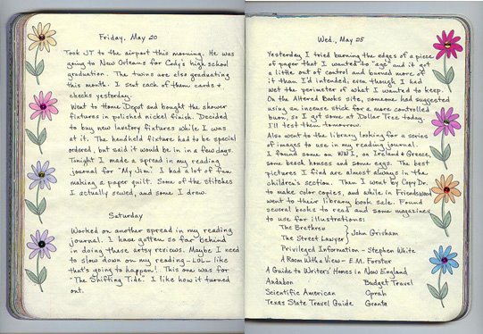
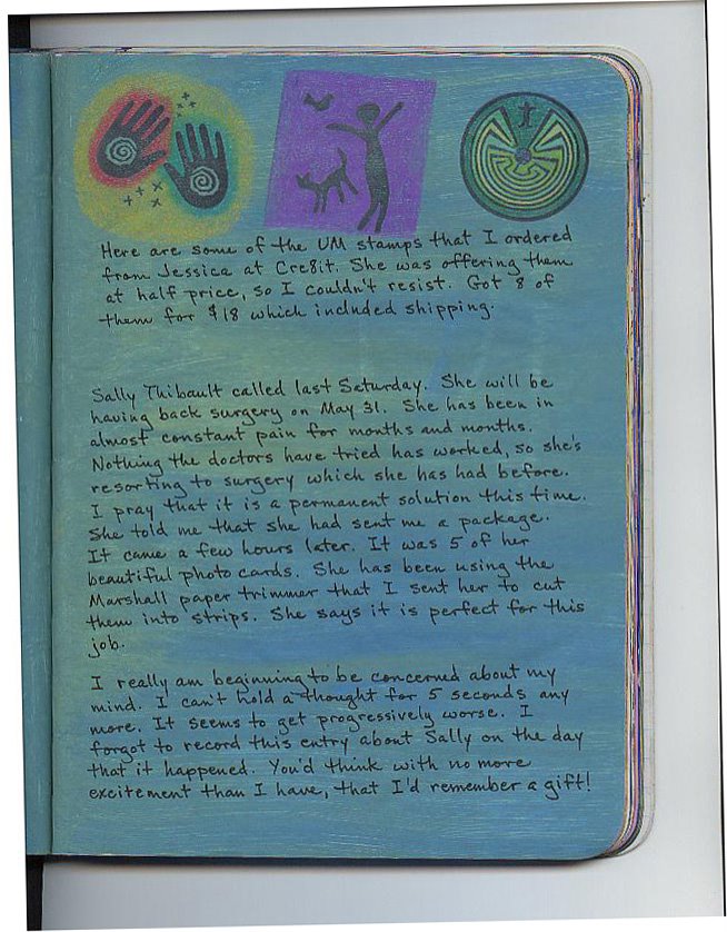
The flowers on this page are so easy and fun to do. You will need brush markers. Here are some different brands of brush markers with their characteristics:

Zig Scroll & Brush - I really like this one. It is waterproof, lightfast, & acid free. It is easy to control--springy, but not floppy. Available in 48 colors.

Zig Brushables - Same quality as the one above, but only available in 24 of the colors. However, there is a brush on each end, one with a deep color and the other with a 50% tint of that color. Wonderful for shading.

Tombow - This marker has a flexible brush on one end and a fine tip pen on the other. It is waterbased, so you can dip it in water to create washes. Available in 95 colors.

Pitt Brush Pen - This only has one drawing end and is smaller than the others. It is pigmented ink that is lightfast and waterproof. Available in 24 colors.

The four types listed above are my favorites, both for writing and doodling. I have used the Marvy Le Plume brush markers, but they are stiffer, so I am not fond of them for that reason.
I think that the Staedtler Mars Graphic 3000 Duo is difficult to write with--it has a much squishier feel, but it is good for many types of flowers.

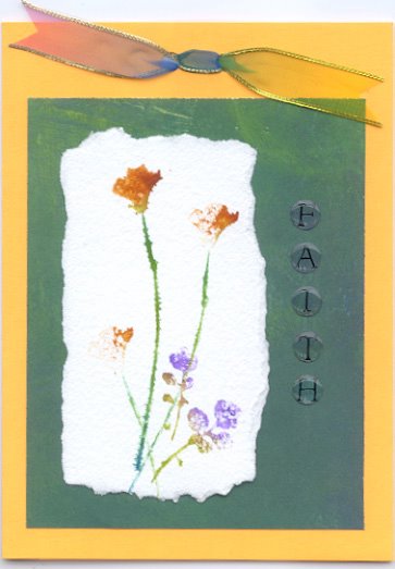
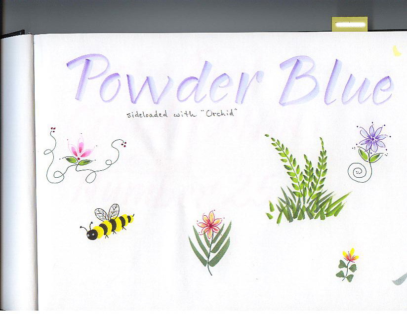
To make the teardrop shapes of the flower petals, lay the brush almost flat to the paper and gently press. Be careful not to wiggle it. Repeat, making the shapes in a circle (or semicircle) with the points facing in. Rotate the page to make it easier to place them. Use a green marker for the leaves, and make them the same way, but press with the points facing out. Use a fine tip in a coordinating color to add the defining lines around the brush shapes. You can experiment to see if you like to add the stems or the leaves first. Add a dot for the center of the flower.

You can make dozens of different types of flowers with these brush markers, as well as vines, ferns, hearts, butterflies, palm trees, grasses, ribbons, stars, suns, etc. You are only limited by your imagination. Just start playing and you will amaze yourself.

Saturday, November 19, 2005

Faux Fresco


While playing around with background techniques, I came up with something that made me think of fresco. I first painted horizontal stripes in primary colors--red, blue, and yellow. That looked too garish to suit me, so after it dried, I brushed it vertically with Delta Ceramcoat "Old Parchment" using a slightly wet brush. Then Anita's "Cream" was sponged on in spots.

Rain, Rain!


On the day Missy and I were to bring back Daddy's cabinets, it decided to rain. My brother and brother-in-law loaded and wrapped them in tarps. They did a fabulous job of protecting them. Even though the rain came down in what seemed like a monsoon, we got them home in perfect condition.

These pages were painted with a glaze made by mixing magenta and ultramarine fluid acrylics with soft gel medium. Then they were brushed with Vintage White acrylic paint that had been watered down.

More Shelves


Here are the shelves that are on the back wall of the closet. They are mostly used to store more paper. It's so great to be able to keep different types separated. I use office letter trays on the shelves to divide them into shallower spaces. For example, on the second shelf from the top, I use two sets of trays side by side to store decorative tissue paper, a variety of vellum papers, metallic papers, acetates and clear envelopes, etc. It makes me feel so good to be able to go right to what I need without having to lift piles of other things off the top.

Shelves Photo


This shows the shelves that are opposite the cabinets in the art storage closet. You can't see it in this photo, but there is a 2-drawer file cabinet and two Iris carts underneath the bottom shelf on the left side. To the right, there is about 2 feet of empty space where I store a folding stepstool that comes in very handy for reaching things on the top shelves. I also store a big Fiskars paper cutter on top of the carts, and there is room behind them for some portfolios and portable drawing boards.

Cabinet Photo


This photo shows the two cabinets that I got from my father's printing business.

MonTueWedThur


This spread tells the story of my efforts to reorganize the walk-in closet in my art room.

For over 30 years, my father was a printer. He had built several cabinets with shallow drawers to hold his printing plates. After he died last year, I told my brother that I would like to have a couple of them. Each cabinet is about 2 feet deep. One of them has 26 drawers that are 14" wide by 2" deep which is just right to hold my rubber stamps. The other one has 39 drawers that measure 12" wide x 1" deep. It is perfect for different colors and types of paper and cardstock.

There were already two shelves on the wall opposite the cabinets, running the 66" depth of the closet. I added two more shelves in between these, giving me a multitude of space to store stamp pads, palettes, markers, xyrons, envelopes, etc.

Organizing


Spread done with acrylic paints, rubberstamps, and Prismacolor pencils.

Friday, November 11, 2005

Strawberry


To get the shifts in color on this page, I cut a piece of acetate with a curvy edge, and used it as a mask when I changed colors across the page. Then I sponged the light blue randomly over all, varying the amount here and there. The strawberry is stamped and clear embossed.

Sequined Flowers


This is a very simple border. Just stamped the flower over and over; colored with a waterbrush and marker inks; glued a sequin in each center.

New Stamps

Making Color Palettes


I wish I knew why my new scanner makes a checkerboard out of every tan-ish color, as it has done with the skin tones around these eyes. I worked on them a little bit with PhotoShop, but they still don't look right.

Lennon


The Imagine8 theme for June was "music," so I decided to incorporate John Lennon's "Imagine" into my piece. Here I was testing to see if Dr. Martin's Iridescent Copper would write well over a photocopy.

Wednesday, November 09, 2005

Godiva Chocolates


I used a ribbon from a box of Godiva chocolates as the focus of this page. For the background, I first gessoed the page, and then brushed over it with Portfolio water-soluble oil pastels. I discovered that ultra-fine Sharpies don't write very well over this medium. I ended up using a Zig Writer with no problems. The date was written with a blue metallic ColorSharp marker. Great pens!

Father's Day


The colors used on these pages were Anita's "Celedon" and "Robin's Egg," Americana "Petal Pink" mixed with some white, and AppleBarrel "Lavender."

Tuesday, November 08, 2005

Fluid Acrylics and Rain


I wanted to try a fresco treatment on the walls of my renovated bathroom, and the directions said to mix universal tint into joint compound. None of the home improvement centers or paint stores would do this for me, although they would have been happy to mix it up as paint. Nor would they sell me the universal tints so I could mix it myself.

The raindrops are in celebration of finally getting some rain on the last day of the driest June ever recorded in the Houston area. We live in a semi-tropical climate, and the normal rainfall here in June is 5". Previously, the driest June was .12" recorded in 1934. As of June 30, 2005 we had received .08". Last year June's total rain was 19". First the floods...then the drought!

Frigidaire


I love this picture of all the neighborhood gathering to see who was getting a new refrigerator. We've lost a lot of this neighborly nosiness, for both good and bad. People are just too busy to pay much attention to what goes on around them. I'm sure many of us know more about some Hollywood star than we do our very own next-door neighbor.

I used "Buttercup" and "Violet" to paint these pages. When you use two complementary colors like these, you will create lovely neutrals where they mix together. You can get nearly infinite variations, depending on the proportions of each color as they blend. Hence, the lovely tans and terra cottas scattered across the spread.

Fourth of July


The background of this page was created with a paint I made by mixing Golden's Fluid Acrylics into white gesso. To about a tablespoon of gesso, I added 1 drop of yellow oxide, 2 drops of phthalo green and 4 drops of black. When I brushed it on, I worked quickly; purposely leaving some unpainted streaks. These bits of white add sparkle and life to a background. The image and title were from a newspaper ad.

Gessoed Kitty


The left page was painted with fluid acrylics (a mix of Golden's yellow oxide and pyrrole red with a bit of Rotring's gold) diluted with water. For the right page, I used Createx primary red and water. I was just playing around with backgrounds, as usual, to see what would happen. I used white gesso to brush over the picture of the cat (from a magazine ad) and then wiped most of it off with a kleenex. It softens the shiny image and makes it look a little more arty.

Drawing Attempts


In this spread, I made a few pitiful attempts to sketch. I'm always preaching to calligraphy students that they must practice, practice in order to increase their skills; but I fail to take my own advice when it comes to drawing. I admire those who can do it with seeming ease, but I'm sure they had to work at it. And that's what I don't do with drawing...so how do I expect to get any better at it? I used to draw constantly when I was a child, and thought I was pretty good back then. Somewhere along the way, I stopped.

These two pages came about when I was playing around with my new bottles of Golden fluid acrylics. I mixed some yellow oxide with a few drops of Rotring gold, and diluted it with water. The right hand page was painted with diluted phthalo blue. While I still had some of the blue in my brush, I dipped it into the yellow oxide mixture, and swooshed it around on the yellow background. Ah, ha! instant plant! So I defined the leaves a bit with a black pen, and gave them some depth and texture with Prismacolor pencils. That wasn't too painful.

By this time, the blue page had dried rather streakily, and I began to see shapes that resembled a landscape, which I outlined with my pen. Added some green and brown to the trees and heat-embossed a crescent moon in the sky. I don't think Van Gogh should be worried!

Buzzing By


A few days ago, I had been experimenting with mixing paint colors by dropping small amounts of fluid acrylics into white gesso. I had created a grey blue, and since I had some of it left over, I used it as the basecoat on these pages. While it was still damp, I used a wet brush to add some phthalo blue fluid acrylic over the top.

Next I stenciled the bee and heat-embossed her wings. Using a silver ColorSharp marker, I drew meandering rows across the page, varying the distance between. These created my journaling lines.

Rubberstamps were used to make the illustration on the right page. They were colored with Prismacolor pencils and Stardust Gelly Roll pens.

Dinner for Two


My daughter and her husband recently bought their first house. It's about 12 years old. On this day, we were giving the kitchen and bathrooms a good scrubbing.

To create the backgrounds here, I painted the left page with turquoise paint and the right side with alizarin crimson. While they were still wet, I pressed them together, and then immediately peeled apart, creating the transfer (and a third color.) The images are magazine pictures. Text was written with a white Gelly Roll pen.

Spices


The background of this spread was done with FolkArt's "Fawn" and "Buttercup" paints. The dragonflies are punched out of a scrap of navy cardstock that had been brushed with Duo Red-Blue Pearl Ex. The word "Spices" was written with a Pentel metallic copper brush pen. The red writing was done with the small end of a RoseArt ColorSharp marker. These are some of the best tools I know of for writing on top of acrylic-painted backgrounds. They never skip, and dry instantly, so you don't have to worry about smearing. The fact that they have dual tips is a nice plus, too! They are available in metallics, as well as matte colors.

Monday, November 07, 2005

Glass Container


I love the beautiful glass container on this page. It looks nothing like the one I bought for Missy at the Alvin Antique Mall--but hey, they're both glass!

The paints on this page are ultramarine and citron green.

Handywoman


This page was painted with "Buttercup" and then drybrushed with "Calypso Blue". The same paints were used on the pages before and after, but you get quite a different look depending on the relative amounts of paint used, which color goes on first, how wet your brush was, etc.

The butterfly is a stamped image that I found when rummaging in my scrap box. It was colored with decorator chalks and blending fluid. I think it was just the oomph this page needed, although it initially went down to cover up a boo-boo!

Neuland Workshop


This spread was created after my workshop with Carrie Imai. I've never been too fond of the Neuland hand, but I liked the variations that she showed us--some of which are shown here. The word "Neuland" was written with a 5 mm Zig calligraphy marker and Carrie's name was done with a 3.5 mm Marvy, then outlined with a very finetip pen, and embellished with interior lines in Stardust Gelly Rolls (which hardly show in this scan).

We used Automatic pens in the workshop. I had never understood why they are called that. There's nothing automatic about them, except the fact that you don't have to pluck a goose and sharpen your quill knife before using one. I went to their website http://www.automaticpens.co.uk/newindex.asp and discovered the answer. My name and "Catch The Rhythm" were written with a No. 4 Automatic (which is almost 8 mm wide) and then glued to the pages. There are two reasons why I used markers at the top of the page. The primary reason is that I didn't have an Automatic pen that would write that small, and the second reason is that I just wanted to write without messing with gouache. I didn't use a Pilot Parallel pen because I found out the hard way on another page that the ink in those cartridges, when used on top of acrylic paint, will easily smear and transfer to the opposite page when the journal is shut. Speaking of acrylic paint, the background for this spread was Americana "Calypso Blue" and FolkArt "Buttercup."

Friday, November 04, 2005

Lawn Mower


This spread tells about discovering a leak in the front bedroom of my daughter's new house, and recounts the story of getting our old Toro lawnmower in running condition for her and Jerry to use on their yard. She was so tickled when I delivered it to her, and it cranked right up. Back when she was 16 and grudgingly mowing our yard, I'm sure she never envisioned a day when she would be thrilled to have her own lawn to mow.

These pages are painted with "Calypso Blue" and "G.P. Purple." The scan barely shows it, but I drew little gold asterisks on the date with a Gelly Roll pen.

A Death in the Family


This spread was done in memory of my former brother-in-law. The obituary was tipped in, and covers more personal observations.

The paints used were "Buttercup" and "Wedgewood Green." I created a little scene with three different rubberstamps and colored pencils.

Olathe Corn


These pages were painted with Anita's "Violet" and "Buttercup" paints. I purposely left bits of white paper showing.

I believe the Chinese call this flying white.

Thursday, November 03, 2005

Chandelier


My daughter ordered this chandelier from the Internet, although she didn't like it when she saw it in person, so she sent it back.

Americana "Cadmium Red" and Anita's "Latte" were the acrylic paints brushed on these pages. I just varied the saturation on the two pages, as well as the direction. When I do a spread like this, I think it pulls the whole thing together to add a bit of the most intense color to the less bold page.

The border on the right page was made with various stencil lines, joined at the corners with a rubber stamp image. Although it doesn't show up well in the scan, the outlines were filled in with a metallic copper pencil.

Busy Day, Busy Page


Old credit cards can be used to spread dabs of paint as was done on this spread. The pages were first painted with a beige color, and then various other colors were dotted on and pulled across with the card. This is too busy for my taste, but it was fun to try, and I can see other possibilities...such as overpainting with a glaze or a light paint, or blending with a wet brush before it dries. It also might be interesting to glue on a silhouette in dark paper or to draw with heavy black lines. You could dab on one color and pull horizontally, then apply a different color to pull vertically. Also, a completely different look would come from a page underpainted with black or another dark color. What about using all metallic paints? Will I live long enough to try all these ideas!?!

Create It


This background was made by smearing on some paint that was left on a credit card after painting another page. There was only enough paint to partially cover the paper, so when it dried, I applied yellow and blue glazes. When those were dry, I softened the whole thing with a cosmetic sponge and white pigment ink from a stamp pad. Later, when that was dry, I brushed on some talcum powder to keep the pages from sticking. I love how smooth it felt when I journaled over it with an "F" Pitt Artist Pen.

Stencils


I painted this page with FolkArt "Linen" acrylic paint and then drew the shapes from the patterns on a stencil. I tried filling the middle one with a Caran d'Ache water soluble wax crayon, but it wouldn't blend smoothly...just kept smearing around and around. I also had trouble with a watercolor pencil in the bottom shape. I don't recall having this problem before. I wonder if the FolkArt brand of paint is more "plastic-y" than say the Anita's brand. I need to do some tests.

Wednesday, November 02, 2005

Home Cookin'


Everytime I go to visit my mother, who's 83, she cooks like there's no tomorrow. We always have a feast. As long as I can remember, she has put up fresh peas in her freezer, and the kind that we know in East Texas as cream peas became a special favorite of all the grandkids. My daughter and her cousins dubbed them "Granny Peas," and that's what we call them to this day!

I painted this page with FolkArt "Linen" acrylic paint, and when dry, scribbled over it with Neo II watersoluble wax pastels, blending with a babywipe.